I was fortunate enough to test drive a photo book from Saal Digital this month. I’ve designed quite a few digital media books over the last few decades with Apple, Google and most recently Mixbook, but Saal offers a significantly higher end option into a crowded vendor field.
Saal Design Software USA
Surprisingly enough creation of the book requires downloading and installing proprietary software and if your hard drive is anything like mine you may be less than thrilled about this little exercise. That said it is quite an intuitive and functional application which handles the “upload” to Saal seamlessly in the background. I didn’t dabble with captions or text with my effort, but before I threw in the towel on a title I noticed that there are an exhaustive selection of font options available. The software doesn’t tap into your own systems font collection so if you have a brand favorite you may be out of luck. There are quite a few pre-packaged template layout offerings, but I opted to free style the pages.
judging a book by its cover
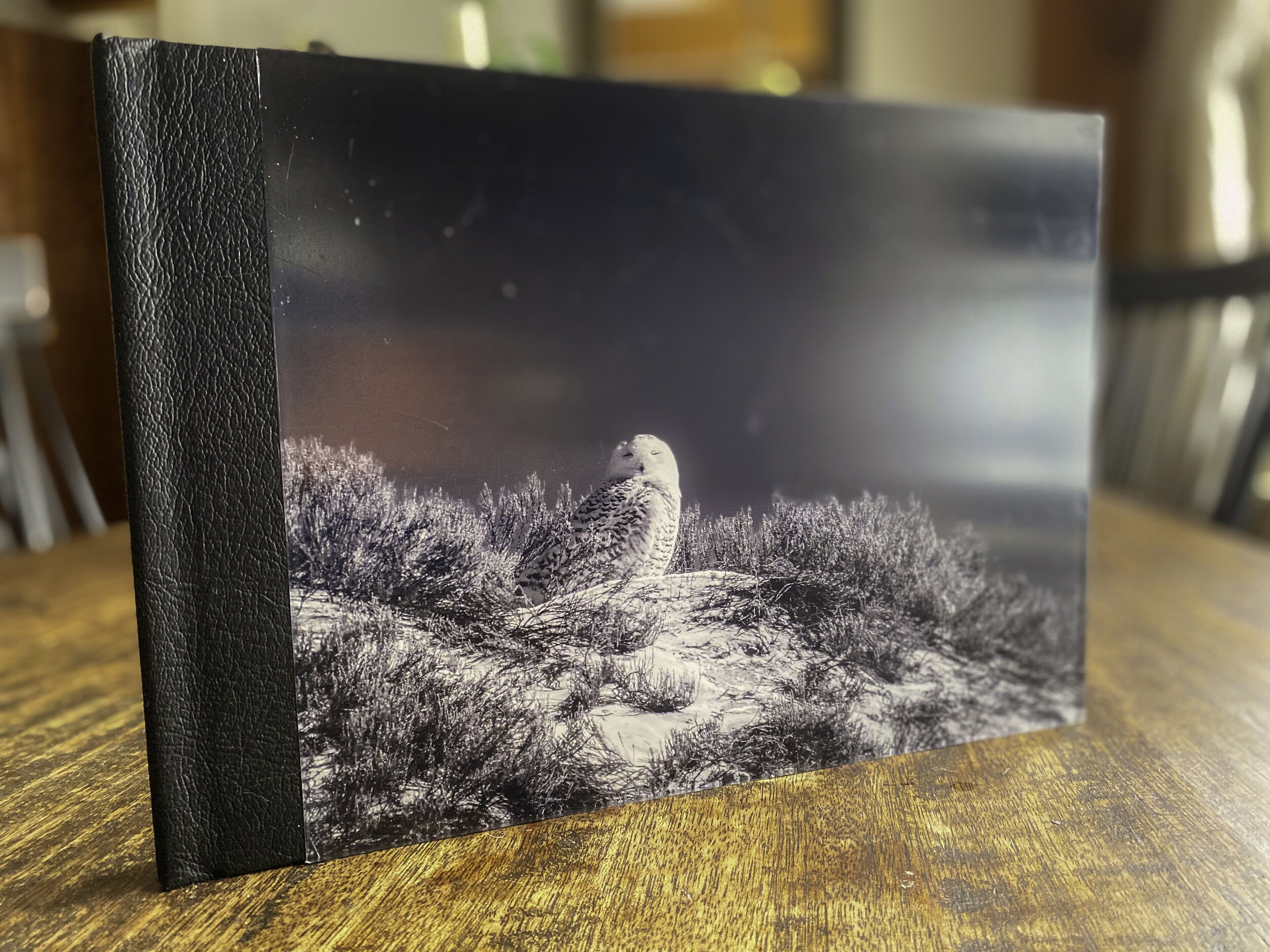
The finished product takes a few days longer to arrive than most of the domestic alternative publishers, but this product is worth the wait. Interestingly the cover is printed on the back of a chunky section of acrylic. If I can ever peel the protective skin off I will attempt a better photograph. I chose the matt finish and feel it is worth the small surcharge. I also elected to go with the thicker “paper”. I am less enamored with this choice as it quite robust (read thick) and makes perusing the book feel a bit like leafing through a children’s book. It gives the book a weighty presence, but seems to tax the binding a tad and keeps the pages from lying flat when left open if that’s important. The cover, in particular, is thwarted from lying flat (see below).
warp factor
The image quality is solid, but I wouldn’t say it rises too far above the more budget conscious options. I may have been a trifle lazy during the layout process, but I genuinely appreciate the full bleeds and two page spread options. With other design software you are sometimes required to hack the layout options to achieve the same effect, but with Saal it couldn’t be any easier. Overall I’m very pleased with my book, but I would caution everyone about selecting the thick paper.
full bleed


